PySensMCDA - Visualizations
Note: this notebook was created for the purpose of providing an example usage of the graphs available in the library. For in-depth sensitivity analysis guide see examples.ipynb
[48]:
## Necessary imports for the notebook to work
import numpy as np
import matplotlib.pyplot as plt
from pysensmcda import ranking, graphs, criteria
Table of contents:
Heatmap
Promotion-demotion ranking graph
Preference distribution
Rankings distribution
Values distribution
Weights barplot
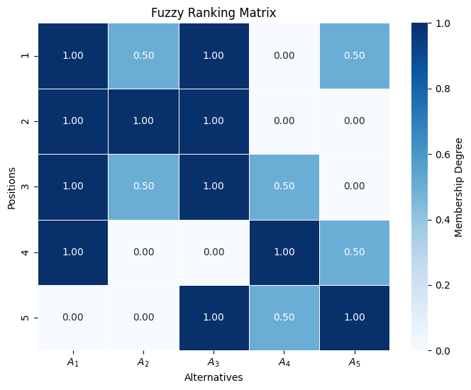
1. Heatmap
The main usage of the heatmap is for visualization of the fuzzy ranking approach
[59]:
rankings = np.array([
    [1, 2, 3, 4, 5],
    [2, 1, 5, 3, 4],
    [4, 3, 2, 5, 1],
    [3, 2, 1, 4, 5],
])
fuzzy_ranking = ranking.fuzzy_ranking(rankings, normalization_axis=0)
graphs.heatmap(fuzzy_ranking)
plt.show()
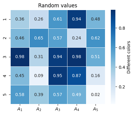
However to the heatmap function can be passed any array that contains different values in form of a matrix. - The xlabel, ylabel, title and color bar label can be overriden. - figsize can be specified
[58]:
random_values = np.random.random((5, 5))
cbar_kwargs = {
    'label': 'Different colors'
}
graphs.heatmap(random_values, title='Random values', xlabel='', ylabel='', cbar_kwargs=cbar_kwargs, figsize=(5, 4))
plt.show()
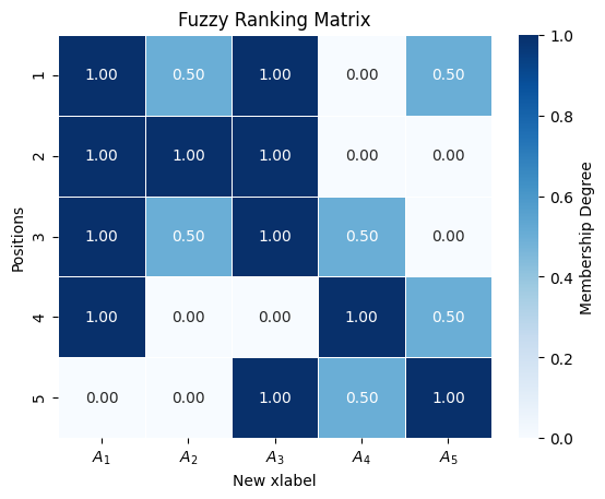
It is possible to create figure before heatmap call and passing ax on which plot should be drawn. ax is returned from function if further changes are necessary.
[60]:
fig, ax = plt.subplots()
ax = graphs.heatmap(fuzzy_ranking, ax=ax)
ax.set_xlabel('New xlabel')
plt.show()
Other parameters:
cmap- changes color map used by heatmapannotate- controls wether numbers on heatmap cells should be shownfmt- controls how numbers on heatmap cells should be formattedlinewidths- controls the width of lines separating heatmap cellslabel_fontsize- controls label font sizetitle_fontsize- controls title font size
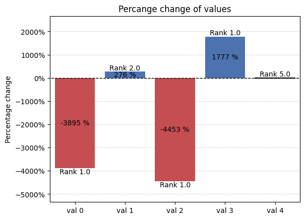
2. Promotion-demotion ranking graph
Promotion-demotion graph includes subgraphs that allow for more freedom or specified use cases
Percentage graph - offers a way to present percentage value changes
[61]:
palette = {
    'positive': '#4c72b0',
    'neutral': 'black',
    'negative': '#c44e52',
    }
percentage_kwargs = {
    'title':'Percange change of values',
    'ylabel':'Percentage change'
    }
percentage_changes = [-3895.4559558861965, 276.3139391152694, -4453.417374310514, 1776.7036818539723, 0]
new_positions = [1.0, 2.0, 1.0, 1.0, 5.0]
graphs.percentage_graph(percentage_changes, new_positions, palette=palette, percentage_kwargs=percentage_kwargs, xticks=[f'val {idx}' for idx in range(len(percentage_changes))])
plt.show()
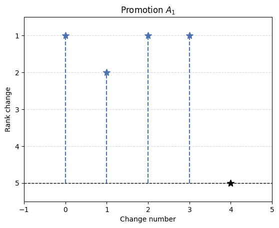
Rank graph - offers visualization of position change of alternatives.
[62]:
palette = {
    'positive': '#4c72b0',
    'neutral': 'black',
    'negative': '#c44e52',
    }
rank_kwargs = {
    'title':'Promotion $A_1$',
    'ylabel':'Rank change'
    }
initial_rank = 5
new_positions = [1.0, 2.0, 1.0, 1.0, 5.0]
ax = graphs.rank_graph(initial_rank, new_positions, palette=palette, rank_kwargs=rank_kwargs)
ax.set_xlabel('Change number')
plt.xlim(-1, 5)
plt.show()
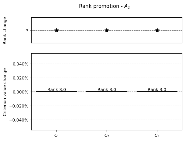
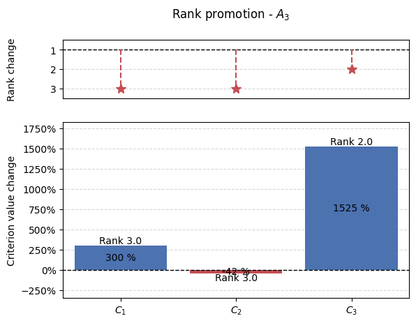
Using promotion-demotion graph as intended the variables should be prepared in following manner when using either ranking_promotion() or ranking_demotion().
[63]:
# For full example see examples.ipynb
matrix = np.array([
    [4, 2, 6],
    [7, 3, 2],
    [9, 6, 8]
])
initial_ranking = np.array([2.0, 3.0, 1.0])
example_demotion_output = [[0, 0, 5.0, 3],
                        [0, 1, 1.5, 3],
                        [0, 2, 7.0, 3],
                        [1, 0, 0.0, 3],
                        [1, 1, 0.0, 3],
                        [1, 2, 0.0, 3],
                        [2, 0, 36.0, 3],
                        [2, 1, 3.5, 3],
                        [2, 2, 130.0, 2]]
crit_num = 3
alt_num = 3
[64]:
results = np.array(example_demotion_output)
for alt in range(alt_num):
    alt_results = results[results[:, 0] == alt]
    percentage_changes = []
    new_positions = []
    if len(alt_results):
        for crit in range(crit_num):
            r = alt_results[alt_results[:, 1] == crit]
            if len(r):
                _ , crit, change, new_pos = r[0]
                crit = int(crit)
                if initial_ranking[alt] == new_pos:
                    percentage_changes.append(0)
                else:
                    percentage_changes.append((change - matrix[alt, crit])/matrix[alt, crit]*100)
                new_positions.append(new_pos)
            else:
                percentage_changes.append(0)
                new_positions.append(initial_ranking[alt])

        graphs.pd_rankings_graph(initial_ranking[alt], new_positions, np.array(percentage_changes), kind='bar', title=f'Rank promotion - $A_{{{alt+1}}}$')

3. Preference distribution
For this plot the data needs to be prepared in specific manner as this plot utilizes FacetGrid from seaborn library.
[65]:
import seaborn as sns
import pandas as pd

methods = ["TOPSIS", "VIKOR", "COMET"]
preference = np.random.random((8, 3))
df = pd.DataFrame(preference, columns=methods)
df = df.stack().reset_index()
df.rename(columns={df.columns[1]: 'Method', df.columns[2]: 'Preference'}, inplace=True)
with sns.axes_style('white', rc={"axes.facecolor": (0, 0, 0, 0)}):
    g = sns.FacetGrid(df, row='Method', hue='Method', aspect=10, height=.75)
    graphs.preference_distribution(g, 'Preference')
    plt.suptitle('Preference distribution')
    plt.show()

This library utilizes this graph mainly for ICRA. See `examples.ipynb <./examples.ipynb>`__
4. Rankings distribution
This graph is mainly used for the visualization of the rankings distribution.
It can be used for single MCDA method:
[66]:
rankings = np.array([[1, 2, 3, 4 ,5],
                     [2, 3, 5, 4, 1],
                     [5, 3, 2, 1, 4]])
graphs.rankings_distribution(rankings, title='Ranking distribution')
plt.show()

Or for couple MCDA methods
[67]:
rankings = np.array([[[1, 2, 3, 4 ,5],
             [2, 3, 5, 4, 1],
             [5, 3, 2, 1, 4]],
             [[1, 2, 3, 4 ,5],
             [3, 2, 5, 4, 1],
             [5, 2, 3, 1, 4]]])
graphs.rankings_distribution(rankings, title='Ranking distribution')
plt.show()

Rankings can be visualized using different types of plots
[68]:
rankings = np.array([[[1, 2, 3, 4 ,5],
             [2, 3, 5, 4, 1],
             [5, 3, 2, 1, 4]],
             [[1, 2, 3, 4 ,5],
             [3, 2, 5, 4, 1],
             [5, 2, 3, 1, 4]]])
graphs.rankings_distribution(rankings, title='Ranking distribution', plot_type='violin', legend_loc='lower')
plt.show()
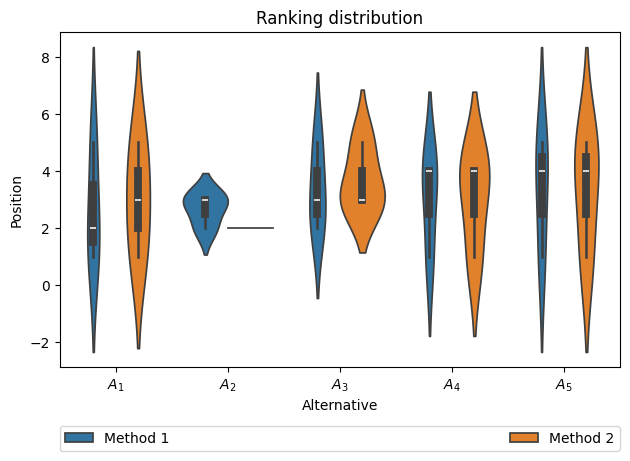
Other parameters:
legend_loc- all options provide legend outside axis. Supported options: ‘upper’, ‘lower’, ‘right’plot_type- type of distribution plot, based on seaborn package. Supported options: ‘box’, ‘boxen’, ‘violin’plot_kwargs- keyword arguments to pass into plot function.xlabelandylabel- controls label on specified axisshow_legend- controls wether legend should be visible
5. Values distribution
This plots offers a way to visualize distribution of values by histogram of kde.
[69]:
fig, ax = plt.subplots()
results = np.array([0.294, 0.306, 0.288, 0.312, 0.282, 0.318, 0.304, 0.296, 0.308, 0.292, 0.312, 0.288, 0.316, 0.284])
# In the case of using sliders, the reference should be kept, so Python wouldn't GC
graphs.hist_dist(results, ax, fig=fig, slider_label='Number\nof bins', xlabel='Value', title='Values distribution', show_slider=False)
plt.show()
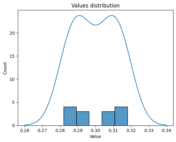
It offers additonal parameter (default=True) for slider to allow chaning bins number in interactive plot mode.
[70]:
fig, ax = plt.subplots()
results = np.array([0.294, 0.306, 0.288, 0.312, 0.282, 0.318, 0.304, 0.296, 0.308, 0.292, 0.312, 0.288, 0.316, 0.284])
# In the case of using sliders, the reference should be kept, so Python wouldn't GC
_, bins_slider = graphs.hist_dist(results, ax, fig=fig, slider_label='Number\nof bins', xlabel='Value', title='Values distribution')
plt.show()

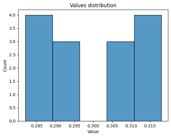
To show only histogram or only kde, kind parameter should be used.
[71]:
fig, ax = plt.subplots()
results = np.array([0.294, 0.306, 0.288, 0.312, 0.282, 0.318, 0.304, 0.296, 0.308, 0.292, 0.312, 0.288, 0.316, 0.284])
# In the case of using sliders, the reference should be kept, so Python wouldn't GC
graphs.hist_dist(results, ax, fig=fig, slider_label='Number\nof bins', kind='hist', xlabel='Value', title='Values distribution', show_slider=False)
plt.show()
[72]:
fig, ax = plt.subplots()
results = np.array([0.294, 0.306, 0.288, 0.312, 0.282, 0.318, 0.304, 0.296, 0.308, 0.292, 0.312, 0.288, 0.316, 0.284])
# In the case of using sliders, the reference should be kept, so Python wouldn't GC
graphs.hist_dist(results, ax, fig=fig, slider_label='Number\nof bins', kind='kde', xlabel='Value', title='Values distribution', show_slider=False)
plt.show()

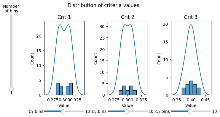
Moreover multi_hist_dist() function is available which enables plotting for multiple criteria / weights / types of values on multiple subplots. If slider is shown additional slider is present to allow changing bins number for all subplots.
[73]:
data = np.array([[0.294, 0.303, 0.403],
                    [0.306, 0.297, 0.397],
                    [0.288, 0.306, 0.406],
                    [0.312, 0.294, 0.394],
                    [0.282, 0.309, 0.409],
                    [0.318, 0.291, 0.391],
                    [0.304, 0.304, 0.392],
                    [0.296, 0.296, 0.408],
                    [0.308, 0.308, 0.384],
                    [0.292, 0.292, 0.416],
                    [0.312, 0.312, 0.376],
                    [0.288, 0.288, 0.424],
                    [0.316, 0.316, 0.368],
                    [0.284, 0.284, 0.432]])
# In the case of using sliders, the reference should be kept, so Python wouldn't GC
_, _, sliders, main_slider = graphs.multi_hist_dist(data, title_pos=0.5, nrows=1, ncols=3, figsize=(8, 4))
plt.show()
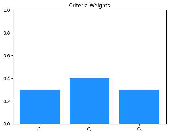
6. Weights barplot
The weights barplot provides a way of visualizing weights for given decision-making problem.
[ ]:
weights = np.array([0.3, 0.4, 0.3])
title = 'Criteria Weights'
ax, bars = graphs.weights_barplot(weights, title)
plt.show()
The weights barplot ca be further modified using different parameters.
[ ]:
weights = np.array([0.3, 0.4, 0.3])
title = 'Criteria Weights'
ax, bars = graphs.weights_barplot(weights, title, color='green', width=0.5, alpha=0.7, grid_on=True, annotate_bars=True)
plt.show()

Parameters:
width- controls width of the bars in the bar plotcolor- can be used to change color of the bars in the bar plotalpha- controls opacity of the bars in the bar plotgrid_on- controls wether grid lines should be drawnannotate_bars- controls wether bar should be annotated with its corresponding weight value
The above plot can be used in interactive version to allow for visualization of different weights vectors. It can be achieved using slider_weights_barplot
[74]:
weights = np.array([0.3, 0.3, 0.4])
percentages = np.array([5, 5, 5])
indexes = np.array([[0, 1], 2], dtype='object')
results = criteria.percentage_modification(weights, percentages, indexes=indexes)
# In the case of using sliders, the reference should be kept, so Python wouldn't GC
ax, criteria_slider, change_slider = graphs.slider_weights_barplot(weights, results, percentage_change=True, annotate_bars=True)
plt.show()
